
Getting Started With Power BI
Microsoft Power BI for beginners is a business necessity. The platform is designed for Microsoft users, with scaling and connection options for data sources. You can centralize your data models for more accessible analysis and make better-informed decisions. Do you know how to connect Power Bi service with its mobile apps?
Essential Metrics For Data Analysis
Did you know the human mind processes images over 60,000 times faster than text? You’ll read that many places on the internet but it’s probably not true. This source of this “fact” is a report by a researcher at 3M Corporation in the 1990s.
That being said, it is a fact that we process images much faster than text. Daniel Kahneman discovered this through his research. It’s a built-feature of humans and the timing of pupil dilation can measure it.
What does this have to do with Power BI? You can look at thousands of rows of data, but it takes considerable time to comprehend it. Or you can look at a Power BI dashboard and comprehend the big picture in seconds, not minutes, hours, or days.
If you want to drill down to more in-depth data visualizations, you can click on a graph in the dashboard and see graphs and charts highlighting a more comprehensive slice of the data. Another click can bring you to the correct area of the data tables.
Best of all, Power BI design is easy, as you will see below.
What Can Power BI Do for You?
Power BI data visualizations make large amounts of data useful. Without visualizations, you’ll waste a lot of time and eventually give up and rely on hunches. In the 2020s, there is simply too much data collected for it to be useful unless you arrange the data into visualizations.
It’s obvious what data visualizations can do for a corporate CEO, but what about a writer? Power BI would be worthless, right? No. It isn’t just companies that collect a lot of data these days. It is everyone.
That smartwatch you wear is constantly collecting data about your health, exercise, location, and even finances. Finances come into the picture if you’re using a digital wallet like Google Pay or Apple Pay. The apps that display the health data use visualizations.
Some of us keep up with our time working on projects through cloud software that works across our watches, phones, tablets, and computers. These apps also provide visualizations.
As a corporate executive, busy professional, small businessperson, and even freelancers, you need to visualize all the work-related data your systems are collecting. Power BI is the perfect system to do this. But there’s one key question to ask: will Power BI connect to my data?
Power BI Connects to an Incredible Array of Data Sources
Unlike some other data visualization programs, Power BI works with most data sources. It works with databases from Microsoft, Oracle, IBM, and more. It works with cloud databases from Amazon, Google, and Microsoft Azure. It works with SQL Server, MySQL, and PostgreSQL.
Power BI connects to SQL databases, NoSQL databases, New-SQL databases, spreadsheets, the web, CRM programs like ZenDesk, and more. There simply isn’t enough space in this article to list all the services Power BI connects to.
Why Businesspersons Need Power BI
Working without a feature-rich business dashboard is like driving a car without a dashboard display. With driving, you won’t know how fast you’re going or how much gas you have without the display.
In the case of running your business, you won’t know your strengths, weaknesses, opportunities, and threats without a good data dashboard.
Remember the writer that uses Power BI? That person has data sources coming from digital marketing services, timesheet software, editing software, and project management software. It all moves through SQL Server via bridges like Excel. From SQL Server, it displays in Power BI.
An Example of How To Use Power BI
Here, we have part of a writer’s dashboard that shows several important data points.
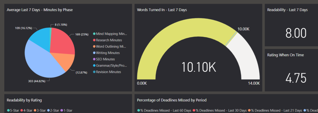
In this dashboard, the pie chart represents different phases of the writing process, including:
- Mind Mapping
- Research
- Outlining
- Writing
- SEO
- Editing
- Revisions
By hovering over the different parts of the pie chart, you can get a better description of each proportion.
The gauge shows the number of words turned in by the writer in the past seven days. The other cards on this dashboard simply show key numbers.
This is only the top level. By clicking on the gauge, you’re transported to a deeper level that gives more detail.
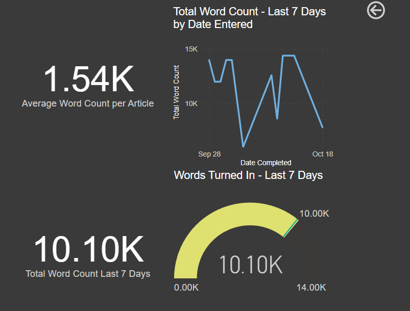
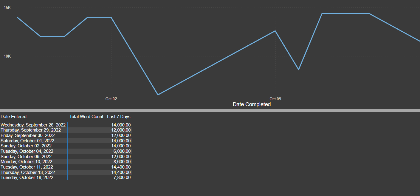
In the line graph, you can hover over any point and see the number for any date. Another mouse-click will bring you to the line graph and the table of underlying data as seen below.
You’ll notice that the “7,800 words” figure on the most recent date differs from the current days’ number from the screenshot above. That’s because this line graph only updates through the day before.
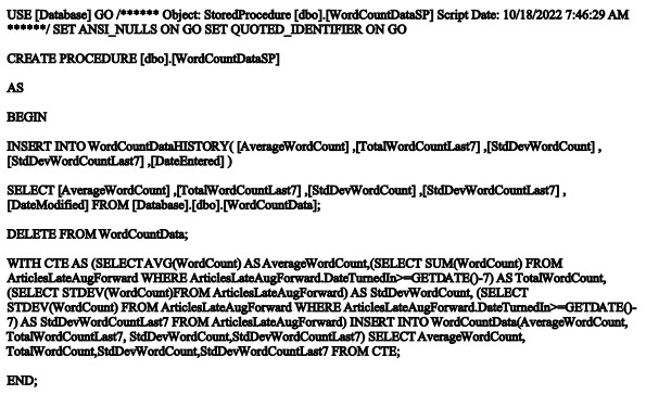
In these examples, the underlying data comes from SQL Server. When using SQL Server, you can slice your data by writing the SQL code as shown below. Don’t despair from the code shown. The next example shows the way most people prefer to shape their data.
The underlying SQL code for this section is:
 An Easier Method of Power BI Design
 An Easier Method of Power BI Design
You don’t have to write computer code like SQL to enjoy Power BI. You could access the tables and then use DAX formulas to shape your data. DAX is less like computer coding and more like Excel formulas. Microsoft provides a cheat sheet for all the DAX formulas on this page on its website.
You publish Power BI reports to your private page at https://app.powerbi.com/. On the website, you can add the Dashboard screen. This page can also appear in modes optimized for your phone or tablet.
Most people create the base level features of Power BI on the desktop program. The screenshots above show the website, but the screenshot below shows the formula bar for the desktop program.
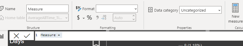 As you can see, it is like Excel’s formula bar. The only difference is you’ll enter DAX formulas instead of Excel formulas.
This is the coolest thing about Power BI. You have the best data visualization tool available, but it’s as easy to use as Excel.
People love Power BI because they don’t have to search through different programs and data. By simply clicking on a bookmark in your internet browser or an app on your mobile device, all your data is instantly there for you.
Leveraging Your Power BI Service
For many people, Power BI is a new program. Sometimes, you’ll need some extra help to get started, but you’ll quickly see it’s as easy as Excel. Some people say it’s even easier. If you need help to get started or you’re working on a complex dashboard, we are here to help.
Trust The Power Bi Service Options At eSoftware Associates
eSoftware Associates knows that using Power BI can increase your business data optimization. We have a team that harnesses BI tools for your benefit. Our experts know how to use all the metrics and apply them to real-time decisions.
Using Power BI unleashes the full Power of your data. Teaming up with eSoftware Associates can help you unlock higher business intelligence potential. To learn more about Power Bi service optimization, contact our team today to schedule a free consultation.Enjoy this article? Share us on social media below or on your favorite sites.